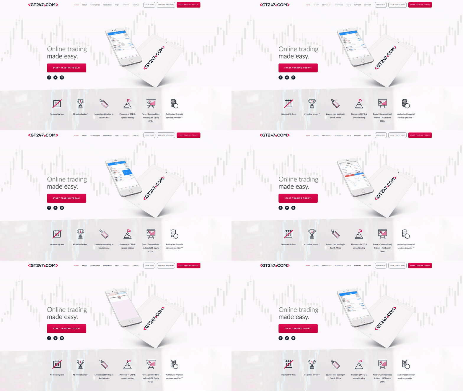
The Home Page
On any brochureware website, the homepage has to make an immediate impact, and calls to action (CTA) need to be prominent The content has to be informative without being overwhelming. To achieve this, MO made use of animated GIFs of the trading platform to show the user exactly what they’d be signing up for. This is supported by simple, bite sized pieces of text with easily identifiable icons. Armed with all the information required, prominent calls to action allow the user to sign up for the new trading platform.

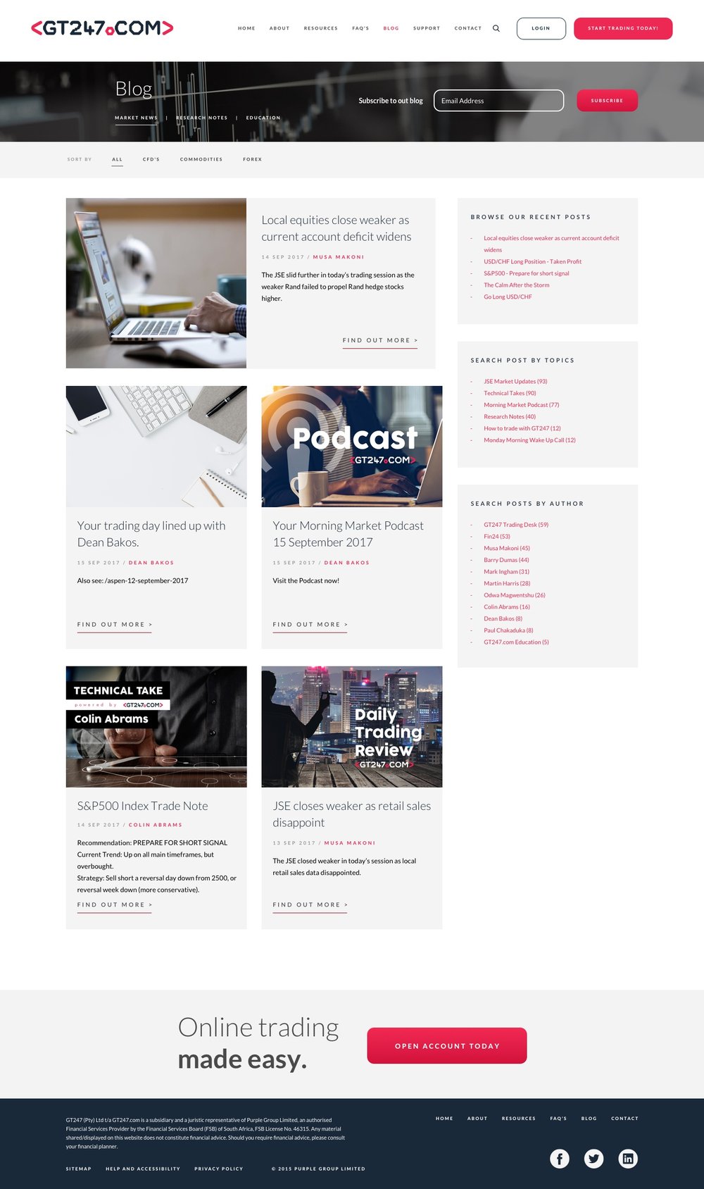
The Blog
MO built a brand new blog layout and imported the existing content into it. The new blog made use of a submenu, displaying the three primary blog categories. A sidebar with a list of authors, that allows you to view blog posts from your favourite author, was added. The overall effect is a blog which is easy to navigate with easy to consume content.


